I've done two partially stylized projects, one of which bordered on realistic. So this time I thought I'd give it a go at making something completely stylized. The shop front seemed to be one that others had the most fun on so it was a no brainer really. You have a good amount of leniency with this project. Any style you want, flat colours, painted detail, a mix of both or any artist style you wanted to pick from. Yet another reason to do this project.
My idea for the shop, is an antique shop, or at least is was at the beginning of the project. Now its a junk shop. Because that way I have a wider variety of asserts I could potentially place around my scene. The idea came to mind from a building in town which has 3 doors on the side, 1 on each floor.
 |
| Initial inspiration. |
The shop in question is a hair dressers, but previously is would have been something else (obviously) I'm not sure what but it would have something that needed heavy items on each floor a lot of the time. Hence the crane/ hoist on the top floor. Another reason I was initially drawn tot he building. I wanted to incorporate this into my shop. A few ideas rolled through my mind, but the one that stuck was an antique shop. A shop you would always be adding and removing large items to and from the premises. So it'd make sense to have this on the building.
I got to work concerting, initially with some traditional sketches, then digital silhouettes and ground floor/ building layout quick paintings. Along with some 3d silhouettes too. I also made a Pinterest board and found some inspiration from there too.
 |
| Initial sketch |
 |
| More initial sketches. |
 |
| Basic silhouettes. |
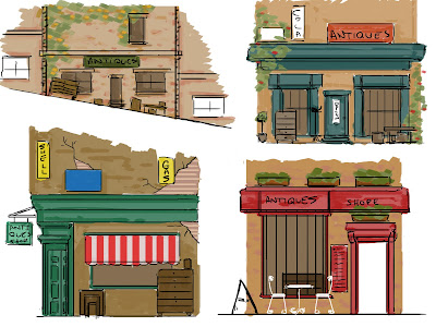 |
| Basic shop fronts 1. |
 |
| Basic shop fronts 2. |
 |
| 3D silhouettes. |
 |
| Final initial idea. |
 |
| More sketches. |
 |
| More ideas. |
After creating and modeling the basic shape of my final idea I felt it was too generic and pretty boring in terms of the silhouette. So I worked into it and came upon the idea of bending the building. Exaggerating on the weight of the items being loaded into and on it. Causing the building to slant to the side, also pulling it up in the process.
I'm still not sure where I want to go with this in terms of the texturing, somewhere in between block colours and fully hand painted. The sheer amount of assets will be a problem in terms of texture space. So some things might have to be block colours while the assets that are more of a focal point, such as the piano will be hand painted.
Christy suggested looking at Dr Seuss and his illustrations, pointing out how he piles up things with extreme balance. I plan to add elements of this to the building, maybe piles outside and around the shop on the floor and definitely on the piano.
 |
| End of week 1. |
 |
| End of week 1. |


No comments:
Post a Comment